It looks great! Maybe add a fullscreen or somthing? Somethings on the little screen in the middle is hard to see. But other than that it looks amazing! And just keep on going! I love it! Thanks
1 Like
I really like this design. I’m new to this platform and it’s exactly what we have been looking for. My friends and Family use Google Hangouts for screen sharing, messaging, and teleconferencing. Rather than re-inventing the wheel and trying to create a video/audio/messaging feature, perhaps you could integrate that into your platform instead. I’m not sure if that is worth considering but I thought I would throw that out there.
Can the settings be set so that the Videos do not auto start when you enter the room until the moderator or room members push the video START button? That would be helpful
2 Likes
It’s great! However, could you make the background of the playlist area transparent such as the background of the chat area. It would look much nicer.
1 Like
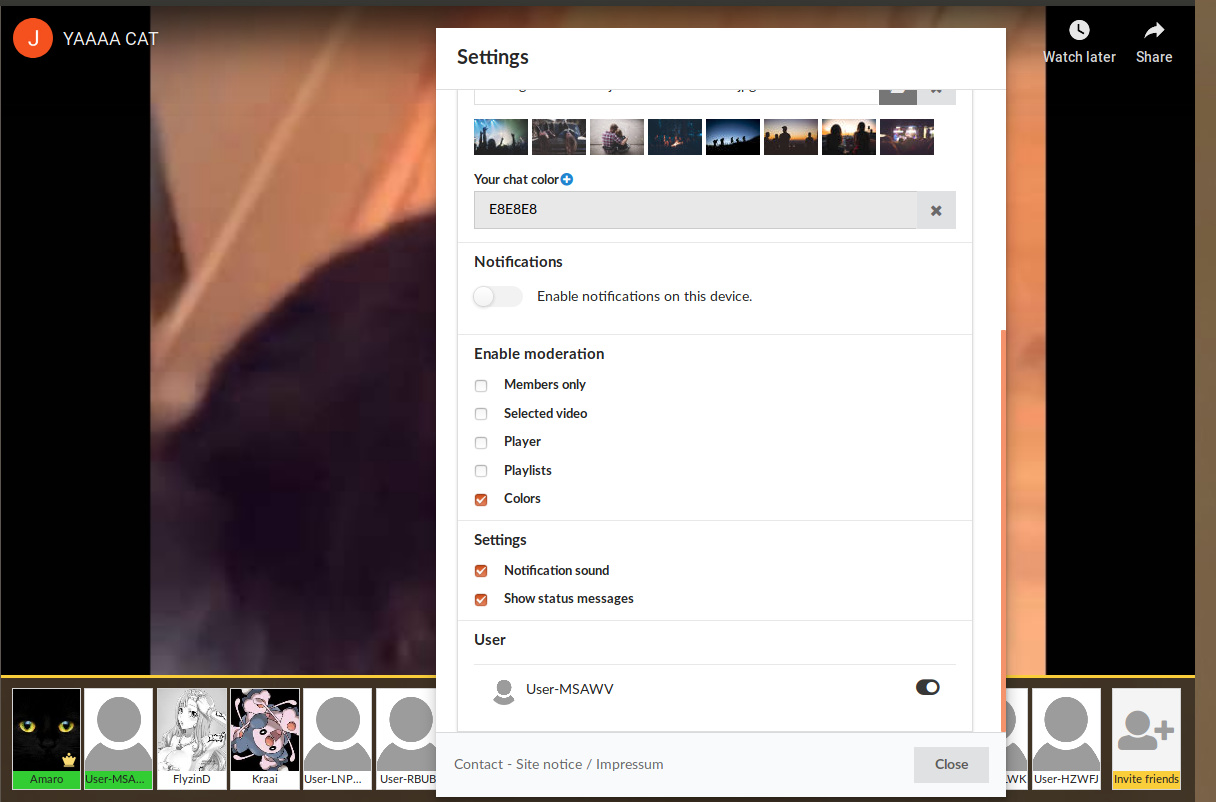
It’s okay, but let us hide the left column.
make sure that we can edit the colour of the left big greay playlist box. it fcks up my whole overlay haha <3
I see there may be much work on it.
But I would really appreciate the possibility to hide the history or the left bar in general.
In general I think it looks really confusing. It looks so squished.
1 Like
je suis complétement d’accord avec la personne du nom de Bavard…je trouve le nouveau layout assez chaotique.je ne comprends pas pourquoi il a été changé.
I really enjoyed the new layout, really different from the previous one, it’s more responsive, has a bigger player, user-friendly…
Design Suggestions: I just think that it should have a option to hide the left menu and right menu, in my case I never use the left menu and the chat (only when someone starts a video).
Technical Suggestions: I know there’s a option to ban people, but I think we should be able to just kick them, I have lots of friends who just join with an anonymous account and then leave and come back with another browser or PC and have different names. What if I ban the incorrect one?
To solve this I was thinking of not saving the users: User-XXXXX on the “viewers” menu, or not show at all.
Finally, continue the good work, the platform is really looking good.
1 Like
I like it, makes the whole site look cleaner and more organized
New design is lit!
But, can you add separate button to go full screen in a player (not in settings section)
1 Like
Just ugly, maybe more modern but the layout is just uncomfortable. i want the old one back as an choosable option.
1 Like
i don’t like the new design. it’s cluttered and confusing, everything besides the player is smaller, although there is enough space, the chat is much smaller and looks messy, the big grey thing on the left side is too dark… 
1 Like
Unfortunately i feel like the new layout it’s too crammed… everything is too close and a lot of space get wasted, the playlist under the chat was perfect in terms of space managing, now there is too much space that’s just empty, and a lot o functions are inconvenient to use… I prefer the old one… a lot…
PS: I love this website…
4 Likes
Thanks a lot everyone for providing feedback! I can’t comment back on every entry but you can be sure i’ll read every message on this thread.
PS: Just rolled out an update that ads opacity to the sidebar on the left.
1 Like
I hate this layout so much. I miss my custom background and the videos being on the right hand side of my screen. The layout is super imposing. I’d really appreciate an option to go back to the old design.
2 Likes
It sucks, old layout was better. It feels way too cluttered.
2 Likes
Thanks for reading the feedback.
I noticed a change on the users tab, you can only kick online people now, and can’t unban anyone. I still have like 10 users (User-XXXXX) which were my friend’s accounts.
I think the best option is to just let us have kick button as well, and still have the option to manage offline users like before.
i dont like the new design  is there a possibility to change to the old one? it looks very clumsy
1 Like
Thanks your feedback @sroy55311 The old layout did not have the video on the right side of the screen. Maybe you can clarify what you mean.