@acamaro9 - Okay this looks like a bug in the userlist. I’ll have a look at it in a minute.
The playlist, rather.
It feels a bit clustered to be honest. I just don’t feel like it is clean & modern. sorry to say, but I’d appreciate a simpler, cleaner more modern design. Still thanks for working on it^^
1 Like
Looks bad i want the old design back
Every new design you introduce is terrible. Just stick with the old one.
2 Likes
I don’t like it, it’s a lot more cluttered than the old layout, there is so much more on the screen then before. I liked it before where it was more of a traditional Youtube layout that I was very familiar with and was easy on the eyes.
Also, for those of that don’t love the new design, could you add the option to go back?
The beta version is way more clean and modern than the previous traditional youtube look, it’s way outdated and it doesn’t look good at all…
One thing I hated on the normal version, was not having the possibility to increase the video size (without fullscreen), the new one provides a bigger video size  .
.
The chat on the normal version it’s outdated.
There is too much background space (padding) on the normal version.
Let’s not talk about how ugly and bad was the mobile version on the normal version. Not going to discuss that.
After the beta being stable, I expect the option to close the 2 menus on the left and right, which will make the beta version even better.
If for reason you want the classic look, not gonna discuss why, then my best would be to have a button to change to the other version. I would love to know why you hate the new design, please send a constructive answer and not the typical I don’t like it blah blah.
Just adapt, you will see it’s way much better.
The bug in the user list should now be fixed!
the old design was much better, can you add a option to replace the new look with the old look instead? multiple people in my room are saying its a eye-sore and I agree, It almost looks like tinychat’s new look.
2 Likes
Please, p l e a s e let us hide the playlist bar.
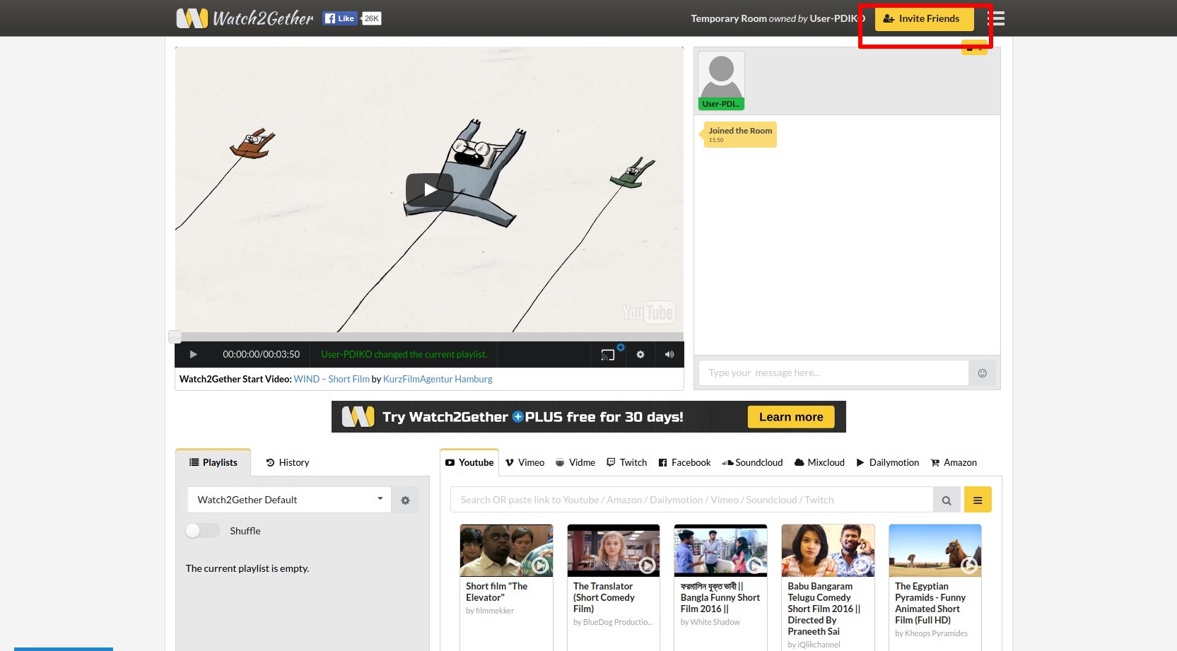
This sidebar is just a grey block and does not help anyone with a small screen. It takes away too much space. In addition to that, i’d appreciate if we are able to use the same background as we already have for our w2g page + opacity option.
With the sidebars left and right the video screen itself becomes way too small and is surrounded by a big chat window and a grey block of playlists.
The video window and the chat window don’t even have the same opacity even tho they should.
The chatbar (where you type in your message) is way too high too. Let it be in one line with the bottom of the video. Make it one line. Much smoother for the eye.
Edit: There is a lot of space unused and certain parts could be placed better.
Edit2: The just searched video would fit underneath the chat bar, so i wouldn’t have to scroll down below the members list. There is enough space for the video, even if the chatbar would be in line with the video itself.
1 Like
yeah… Adapt… thats why tinychat’s new look (Which nobody wanted but sadly had to “adapt to it”) is glitchy as all hell to this day when it was much better back in 2011, NOT TO MENTION that cams barely work on the site anymore, barely anyone moderates it now, and the design is just atrocious. You really are a yes man dude. Until this site has a option to change back to the old look, I will have to take my business elsewhere, despite how barren the alternatives are on group chatting.
Very good i’d just suggest adding a waiting list
It’s very cluttered and makes actually watching videos distracting
I’m not a “yes man dude”, I know I seem like in my post but sometimes I do hate some design changes that some websites do (reddit for example), but this one seems promising and didn’t break any functionality like Tinychat. Also this one is still in beta, it will have lots of changes, that’s why you should say what’s wrong with it and what should change. There’s a lot of potential with this version, I said to everyone to adapt because they all seem to say the same reply, “Ahh it sucks”, “I don’t like it”. After all this is a free service, some people do not have respect for it. I’m not saying you don’t, but some do not respect.
1 Like
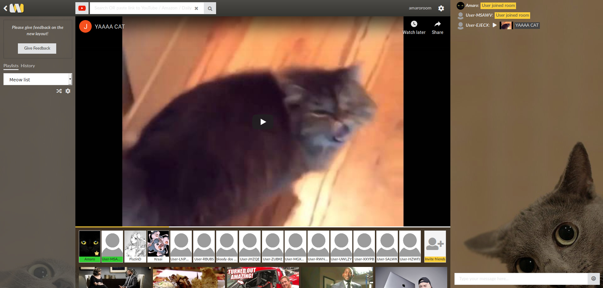
the video is smaller, you can’t hide the playlist, the chat is clunkier and harder to read, you can’t make the reccomended videos go away or scroll them away
Please give an option to hide the chat. And maybe place the playlist somewhere else? I personally don’t like it, that it takes the whole left side. I really don’t know how to feel about this new design…
1 Like
Really annoying design, it’s not fun to use anymore. Please don’t change it. I really really dislike the way it looks now. If you need it, give us an option to change between the old one and the new one
You’re right! Totally feel this comment!
indeed… maybe your right, it’s just like scottchiste said above your post just now " It’s very cluttered and makes actually watching videos distracting" the cams are a bit too small enough to be a eye-sore for their normal size (ENLARGING cams does help somewhat), some people on mobile browsers like google chrome can only see a fair amount of users instead of all the users that are on cam and I bet now with this new look… they might have more of a tough time camming or micing up, I know a person who has been having this issue for a while in our room. The player is sort of way too big, sometimes people can’t hear one particular person in a chat room and have to re-cam when they find out that person has been talking and they can’t hear them. The user-list is partially related to the issue on mobile users but banning and unbanning every lagged guest doesn’t always do the trick like I tried to recently.
1 Like
I really do not like this new design at all.  If it’s at all possible, please make the old design or an alternate layout be an option.
This breaks W2G on my friend’s second monitor, and for me, I just don’t like where everything is placed.
Users should be at the top, preferably much smaller or far out of the way like it was before.
I think video being on the left while the playlist/chat are on the right just makes the most sense.
Being able to hide/never show the “recommended videos” underneath would be great as well.
Also, I preferred the old way of showing users online/offline - I keep thinking that for some reason everyone is online, when really only 2 people are. Either prefer the offline users to be dimmed out or just not shown at all.
I have several friends who joined to watch 2-3 things and no longer are part of the community, being able to remove inactive users from the list without banning would be nice.
3 Likes