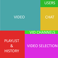
Current Layout
Concept
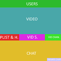
Users would be at the top row and have a fixed size. This bar only displays users that are currently online. Fixed size for cam or still image.
Video would be fixed and size would follow browser window size. Audio only option, great for when listening to lectures or pod cast.
Playlist, History, and video channels would all be on the same row, below the video window. Each option would have its own button and all drop down menus.
Video Selection would be a window that pops up over the video window and displays options and search in a transparent backdrop.
Chat would be below the video screen and would have a small fixed tab for private messages. The tab will display number indicating how many messages you have, and once clicked it will display the user names.
*Also the Room owner should be the only one able to control the room background, colors and main room settings.
Hope this helps!
Doesn’t really look like a comfortable UI you’re trying to represent. It looks extremely uncomfortable to have chat UNDER the video.
Its something to play around with, I use a site that has a similar layout and it works pretty good. The users can even be switched to be directly on top of the chat. Its all about trail and error.
Thanks a lot for your ideas and the effort you made for this proposal! I’m always open to hear input for improvement and future Watch2Gether versions.
What do you think is the mayor advantage of your layout or what current issues are you trying to fix with it?
I would also like to hear feedback from others on this.
I don’t really have a concept to show it but I’m very pleased with the current UI. The only thing I’d suggest changing is perhaps making the video selection a drop down menu on the left side of the screen. That way you have space for whatever but then again it’d be covering side of the screen ads if that was the case so I suppose it’d be bit of a bad idea.
However, I like the current UI of room layouts.
The major advantage would be the flow of the website. The video selection and playlist/history is just using up way too much space and can be put in a better format. Just an idea to sandbox. I do like the current, just feel it can use a little better organization to be more fluid.
Ok, thanks a lot for your input! I appreciate it!
I think the problem I see with the current layout is that if I want to see the chat, the video player is kind of small. I can fullscreen watch2gether video, but then I can’t really multitask.
If you could pop the chat out, or have a button to hide it, or move it down, that’d be good. Right now I’m using a custom stylesheet to increase the size of the video.
.ui.container {width: 100%;}
#player-chat {width: 100% !important;}
The page widths are pretty constricting on that player size. Which is why I mod it.
Thanks for your input! I will for sure work your feedback into the next versions of the site.

