Our room’s Video History is glitched, watching videos doesn’t add them and it’s full of video watched ages ago. Also the room’s thumbnail shows one of those in the history and not the one currently playing (like I think it did before?)
Also I kinda dislike the new layout but that’s subjective and many others already said that.
Thanks for your feedback! There was indeed a problem with the history. I just rolled out a fix and the history should now show the correct entries. Can you have a look and let me know if it works for you now?
If you could add differentiated colors on the list when editing playlists would be a big help on not accidentally removing the unintended playlist would be nice
Fx. Manage playlists
Not highlighted row: PL 1 (Playlist 1)
Highlighted row: PL 2
Not highlighted row: PL 3
Highlighted row: PL 4
Another version is where you hover over the row the row would be highlighted as long as the cursor is there
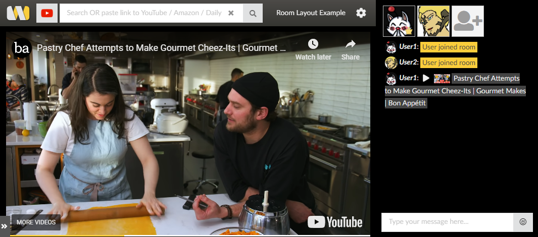
Is it possible to bring back the ability to click on the video title in the chat in order to open the actual YouTube video? It would make saving a video or liking one way easier than searching for it.
Hey, I’ve used your site for ages now and I am so glad you offer these services, but, your last changes to the layout just baffled me.
For example, in the previous layout, you were able to open the YouTube video by clicking the title of the video below the video itself. In the current layout, you have to manually copy the URL of the video and paste it in a new tab. Speaking of titles; why is the title only displayed in the chat and not actually below, above or on the video itself? It doesn’t make sense.
Changing the position of the playlists doesn’t make sense either. It’s way too small. It almost feels like it’s just pushed to the side for no reason at all. The chat screen has become bigger, but I really don’t get why there’s a need to make that feature larger. Were there actually people who needed a larger chat? Was the old position of the playlists that bad? Is this honestly an improvement? I just don’t understand.
The position of the search bar compared to the position of the results is really odd too.
I really, really like to know why you change things that don’t seem to be broken in the first place? Why change the position of the playlists and chats? Why remove the title from videos or the ability to immediately open a YouTube video? It almost feels like you want to force change just because of change.
Again, I use this site almost daily, and I appreciate the updates, but this Layout change just confused me. It made no sense to me at all. Please, please stop changing things that aren’t broken.
Thanks a lot for taking some time to provide feedback. The clickable links will return, most likely next week. Regarding the change in general: The new layout provides more flexibility for different screen sizes. Using the playlist for example was extremely difficult on small screen resolutions with the old layout. There have been additional changes under the hood as well which will make the site run faster and scale better.
I understand that it does not make much sense for you since you were happy with the existing layout. But I would like to point out, that there has been very positive feedback on the new layout as well. It’s just not so present here in the forum.
Having said that, I’d like to make it clear that I’m very open to constructive feedback, especially from long term users like you are and i hope that you will become as happy with the new layout has you have been with the old one!
@florian I just wanted to comment on the newly added collapse/expand button for the playlist side menu, and I love it. It works wonderfully. I don’t think there is one added for chat yet (I could be wrong, maybe my eyes are overlooking it), but I would love to see something added for that as well. For my personal uses, while I’m sure many groups use the chat feature, we personally use Discord for our group since that’s where we all talk together anyways, so for our personal uses it would fit better to have the video fill the browser window when possible when you don’t want full screen, and then have the ability to expand/collapse the playlist side menu as needed.
Also, I noticed that Playback Speed was removed/left out under the video options button, the only option I see now is Full Screen. Was that intentional, or was some older code for the previous options menu layout mistakenly used in the update?
Also, some users were mentioning the location of the user list, I decided to spend a few min and move some stuff around to give a suggestion on relocating it.
I moved the entire frame up above the chat window, resized the icons a bit so they aren’t as huge, hid the user name label to 0px but my idea was that when you hover over the icon the name label would expand up just like how the video controls do when your cursor is over the video frame.
The ad frame I left below the video and above the search results, I think it works well there.
Like I said, I really only put in like 5 min of work but I did notice that when the user list is up there, the Add User image’s z-index is above the popout video frame, so when you scroll down the image is hovering over the video while the rest of the user’s avatars are behind the video.
I appreciate that you took some time to provide your input! The user list location your are proposing works fine when there are just 2-3 users in a room. Once there are more, you will have to scroll which can be annoying especially with the web cams switched on…
Many on you criticized the way the new chat looks. I have just rolled out an update which unclutters the chat layout and returns to a layout based on chat bubbles. This updated restores the ability for +PLUS users to change the background color of chat messages as well. I hope you like the update & please keep the feedback coming!
can you add an option to use the old version me and my fiancee dont like the new version aswell when you add a playlist and then remove it you cant add a new playlist
Hi @damoncarl that sound like a bug. I tested the playlist system and adding / deleting playlists seems to work fine for me. Can you provide a step by step guide to reproduce this issue?
I absolutely hate using this new format. Any time I load into a room; be it my own I created, or into a friends; it always loads this one random video that has what looks like and endless stream, and no way to change the video. Any time i put in a video, my friends can sure as heck see it but I can’t. And there’s NO obvious way of fixing this so I can see the video too. This new setup is a mess and no matter how much I do “research” on how to use it. I cannot. I liked what it used to be. Simple, obvious: in other words. NOTHING LIKE THIS IS. >:(